UX is about solving visual problems, it’s about organizing, economizing & communicating (Not aesthetics).
The first experience people have with your product is the most critical. It will determine whether people will continue to use the product or never use it again. People need a reason to engage and need continuous proof it is worth their time to remain engaged.
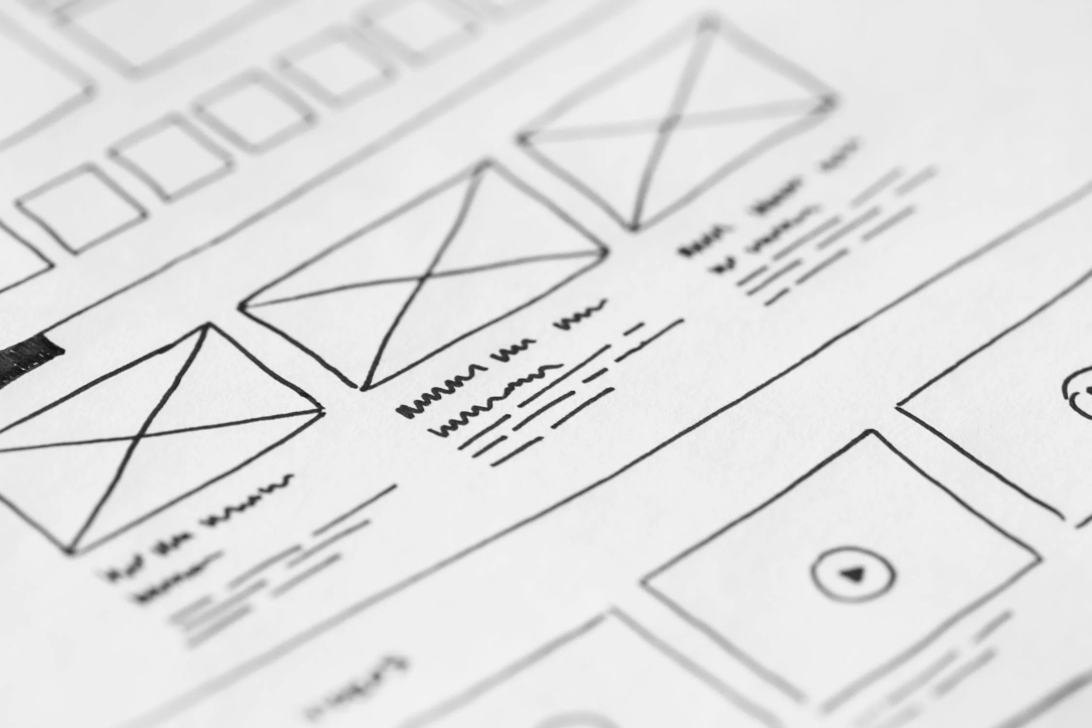
FOUR KEY ORGANIZING PRINCIPLES
When the design is not working one of these four things is either missing or misapplied.
PROXIMITY
ALIGNMENT
Elements visually close to each other are perceived as a single group.
Unrelated items are visually separated.
Group related elements contextually to form a perceived whole.
Negative space enables focus.
Provides cognitive stability.
Visual relationships.
Every element in a UI should be aligned with one or more other elements.
When in doubt align everything.
CONTRAST
Areas of highest contrast draw viewer attention.
Contrast should be applied according to the importance of particular element.
Primary content or actions should have the most contrast.
Information hierarchy is mainly created by contrast.
Always consider contrast before colour.
REPETITION
Create a hierarchy of visual styles - Font, colours, textures, graphical elements.
Re-use elements of those visual styles, both in corresponding styles and in visual elements.
Established design patterns are specific, recognizable, patterns that people know and expect.
Purposeful repetition increases visual consistency across the parts and the whole user experience.
Economize
Users have to decode every element you place on the screen. The usefulness of onscreen elements decreases when their number increases as users need to use their limited cognitive energy to decode each element. Economy in design helps people manage complexity maximize signal & minimizing noise.
Minimize cognitive load.
Only show elements critical to communication.
What is included must be immediately relevant to the task at hand.
Visually emphasize critical elements and actions (Primary, secondary, tertiary).
Progressive disclosure
Helps people manage complexity maintaining the focus of a user's attention by reducing clutter, confusion, and cognitive workload. This improves usability by presenting only the minimum data required for the task at hand.
Information presented to a person who isn't interested is noise.
Only necessary or requested information is displayed at any given time.
Show what matters first.
What is required to take the next step?
Initially show only the most important options.
Communicate that more is available.
Disclose additional features/info only if the user asks for them or needs them.
Prioritize according to user needs & business goals.
Communication
At a glance, the brain is processing possible answers to these questions:
What does it do?
How well does do that?
How hard is this to use?
What's it going to cost me?
COMMUNICATE VALUE MEET EXPECTATION
Rapidly establish the value proposition in the viewer’s mind leading them toward continuing the experience.
Match the user’s prediction.
Add immediate value.
Add positively to the cumulative experience over time.
Deliver proof that the person is moving closer to achieving their goals.
FIRST VISUAL EXPOSURE OBJECTIVES
Rapidly establish the value proposition in the viewer's mind.
Lead them towards continuing the experience further.
Introduce new information and enable action at the most relevant, most appropriate points in the experience.
COMMUNICATION CHECKLIST
Focus on how your visual design choices work, not how they look.
Is what’s on the screen in line with what we said we were trying to accomplish strategically?
Does the UI help the user understand the options that are available?
Does the UI help the user understand how things are related to other things?
Does the UI provide clear guidance as to what actions can be taken?
Does the UI provide clear guidance as to what the user is suppose to do next?
Does the UI hint at what might happen after the user acts?
COMMUNICATION TIPS
Consistency between parts (Software) and the whole (OS) creates ease of use.
UI conventions can help you communicate.
Conclusion
Remember that you are solving visual problems. Focus on organizing, economizing & communicating and UX will take care of itself.